Explanation
This demo was created to demonstrate how in the theory of relativity the effects of length contraction and time dilation work together
Problem
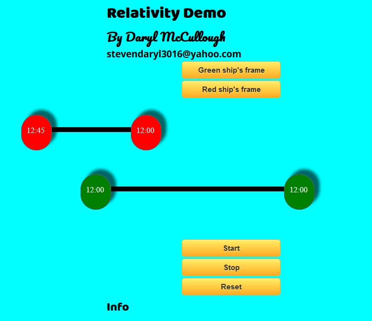
In the demo, I show stylized representations of two spaceships traveling side-by-side, one the “Red Ship” and one the “Green Ship”. Each ship has a clock at each end of the ship. The user can click a button to switch back and forth between the rest frame of the Red Ship, in which the Green ship seems to be contracted in length and its clocks seem to run slower, and the rest frame of the Green Ship, where it is the Red Ship that is length-contracted and time-dilated.
The challenge was how to organize the visual display of information to show that the views from the two frames are consistent.
Solution
Visual representation of ships
Visually, each ship is represented as a thin rod, and on each end of the “ship” is a clock showing the time at the end of the ship. In front of each ship is a variable length invisible “spacer” div whose length can be adjusted to change the position of the ships. The four parts of each ship are all “floated left” so that they line up horizontally. The parts are:
- A spacer to control the position
- A left clock
- A very long, skinny div to represent the ship
- A right clock.
Code representation of the ships
I used the javascript prototype to represent the two ships. Each ship has the following properties:
function Ship(leftClock, rightClock, leftSpacer, rod, name) {
    this.leftClock = leftClock; // a div representing the clock on the left end of the ship
    this.rightClock = rightClock; // a div representing the clock on the right end of the ship
    this.spacer = leftSpacer; // a div to the left of the ship; its left margin determines the position of the ship
    this.rod = rod; // a div representing a rod connecting the left and right clocks
    this.leftTime = 0; // the current time on the left clock, in minutes past 12:00
    this.rightTime = 0; // the current time on the right clock, in minutes past 12:00
    this.rodLength = 160; // the length of the rod in px
    this.leftPosition = 0; // the position (from the left of the window) of the center of the left clock
    this.rightPosition = 0; // the position (from the left of the window) of the center of the right clock
    this.clockRate = 1.0; // the clock rate (minutes per "tick")
    this.moving = false; // is this the moving ship?

    this.setMoving = function (moving) {... // makes it the moving clock if moving == true
    }

    this.setPosition = function(start, increment) {... // sets the position after elapsed time
    }
    this.renderClocks = function() { // converts times on clocks to the format "hh:mm" and displays result in the corresponding divs
	...
    }

}
Executing the animation
In the main function myMove, I used the javascript setInterval function to
advance the animation once every 50 milliseconds. Each interval, I run the
function move, which advances the counter pos and then sets up the ships
according to this counter by calling the function setupShips. This function
sets the clocks of the two ships and changes the position of the “moving” ship
function setupShipsAux(ticks, mover1) {
    mover = mover1;
    for (var i = 0; i < ships.length; i++) {
        var ship = ships[i];
        ship.setMover(mover);
        ship.setTicks(ticks);
        ship.setPosition(startPosition + pos_delta, ticks);
    }
    pos = ticks;
}

function setupShips(ticks, mover1) { // calculate ship parameters for given number of ticks; mover1 specifies which ship is moving
    if (ticks === undefined || ticks < 0) {
        if (mover1 != mover) {
            ticks = Math.floor((ships[0].ticks / longRate) * shortRate + 0.5);
        } else {
            ticks = ships[0].ticks;
        }
    }

    setupShipsAux(ticks, mover1);
}


function myMove() {
    id = setInterval(move, 50);
    function move() {
        if (pos > ticks_max) {
            clearInterval(id)
        } else {
            pos++;
            setupShips(pos, mover);
        }

    }
}
Flipping the Frame
The demo has buttons for switching from the point of view of the Green ship to the point of view of the Red ship. Clicking the button triggers a recalculation of the length of the ships, and the values of the times on their clocks.
Results
The resulting animation works pretty well, although there are a number of things that could be better. If the ships run into the edge of the window, they “crash” and become broken. This is due to the way that the ships are created by multiple divs that are only connected because they “float” next to each other.
But if the crash doesn’t happen, the demo works pretty well to demonstrate the primary effects of relativity, and particularly shows that the two points of view are consistent. Many students of relativity have a hard time seeing how it isn’t contradictory for each ship to think that it is the other one that is length-contracted and time-dilated. This demo shows that despite having different views of what is going on, both observers agree on all the objective facts about the scenario: namely, what times are showing on the various clocks as they pass each other.
The completed project can be viewed at my website
Conclusion
This project was an effort to demonstrate some of the effects of relativity for students. I wrote the program before I was very knowledgeable about writing programs in javascript and CSS, and so there are a number of things that I would do differently if I had to do it over. (Which I still might). The biggest change is that I need to use absolute positioning to position the ships, instead of the kludge with spacers. Another change would be to make a graceful transition when the ship reaches the window boundary. Finally, it would be nice to make it more responsive, so that it could be viewed on any size screen.
Also, it would be nice to have a suite of demos relating to relativity.